Thursday, November 29, 2012

Journal Page no. 2 - reimagined

Last week, I posted an updated, reimagined version of my very first journal page.  I also wrote about my reasons for making the change:  more colour, hand-drawn lettering, fewer design restrictions and, in the end, a page design that I feel comfortable using for years to come. 

Reactions to the new page were mixed, with some lovely commenters preferring the old version, some preferring the new one, and some liking both.  It was really delightful to read all of your thoughts and I am so grateful for your comments.  They are always on my mind when I'm creating new pages and thinking about new projects.  I will be totally curious about your views on this next page, so please don't hesitate to let me know what you think.  :)

Okay.  No more stalling.  This is a photo of the original Journal Page no. 2 when it was posted on Friday, June 4th, 2010:

This is the new page:

You'll find that most of the prompts are exactly the same, except for the lightning round, which is entirely new.  The design, colours, and lettering:  also new.

The colour-free version looks a little like this:

As always, I hope you'll enjoy this new page.  If you'd like one for yourself, you'll find the colour-free version here and the colourful version here.

Stay tuned for Journal Page no. 3 in its reimagined form, which should find its way to this space next week.

Until then, happy journaling!

hugs,
Christie

Tuesday, November 20, 2012

Journal page no. 1 - reimagined

This is a photo of Journal Page no. 1, way back when I posted the pdf on Thursday, June 3, 2010:

In the almost two and a half years since, we've come a long way.  (Baby.)

There are now 50 pages and when I flip through them, from 1 to 50, I can see and feel the evolution in the prompts and doodles.  I am immensely proud of my collection of journal pages.

And still . . .

I want them to be better.  I want them to look better.  I want to be able to expand on these pages for years to come, but when I sit down to work on them, I'm stumped.

I've gotten to a point where I feel restricted rather than inspired.  Specifically, I feel restricted by the size, the layout, the colour palette, and the typefaces on my pages.

So I've been thinking about it.  A lot.  And I've made a few changes.  Changes that I hope will help me feel less restricted and more inspired.  Changes that I hope will lead to better pages, for you and for me.

Page size

There isn't much I can do about the size.  I gave it a lot of thought and tried other options, but as printables, the pages work best and most practically on letter-sized paper.

So, the size stays.

Layout

I also fiddled a lot with the layout.  Up until now, I've been using a sort of grid layout.  Three parts across and three parts down.  I tried all sorts of alternatives, including completely deconstructing the layout, but I found that unless there is some sort of order, the page loses its cohesiveness.

So, I got rid of my old grid and I'm working a little more by feel these days, although I don't think the layout change is overly noticeable.

Colour palette

In terms of colours, I wanted more of them.  So I mixed a few of my own colours using the fun sliders available in Illustrator's colour guide and this is what I came up with:

Staying with colours for a moment longer, I've also added textures to my colours and polka dots and stripes and stuff.  Just for fun.  Because I was getting tired of blocks of straight colour.

Also, I'm now offering only two versions of each page:  a colour-free version and a colourful one.  The colourful version is fully coloured, all of it.  It seemed strange to offer a colourful version before in which only the border was coloured.  Why not all of it?  I don't know.

So, new colour palette, new textures and slightly different pdf alternatives.

Typefaces/Lettering

Last item:  the typefaces.  I began to really dislike the look of standard typefaces mixed with doodles.  One or the other, but not both.

So, the lettering is now hand-drawn.  (From two typefaces that I love.)  The lettering is not a font.  I drew in every single letter you see.

Gosh, I guess I can't put it off any longer.  A little nervous here.

This is Journal Page no. 1, reimagined in colour:

This is the colour-free alternative:

If you already have a copy of the original page, you'll notice that some of the prompts are exactly the same and some are new.  I've also added a few items to the lightning round.

I'm still working through some of the organizational issues, like what to do with the old Journal Page no. 1.  It's sticking around for now, but probably not forever.  There will soon be changes to the right sidebar, too, to reflect ongoing changes to the journal page collection.

Journal Page no. 2, the reimagined version, will be posted next week.  No. 3 will follow the week after that, and so on and so forth.

As always, I'll figure it out as I go along.  For now though, I hope you'll enjoy this new spin on an old page.  If you'd like one for yourself, the colour-free version is here and the colourful version is here.

hugs,
Christie

Tuesday, November 13, 2012

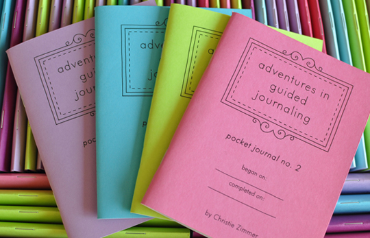
Pocket Journal No. 2 and more!

Whenever I take an extended break from this space, it takes forever to write that first post back; several drafts, usually, to remember how it's done.  The post you're reading is draft number six or possibly seven.

I've been spending a lot of time at the computer over the last month, drawing and writing and revamping.  I love it, dreaming up new prompt and doodle ideas, but it's nerve-wracking, too, because it takes time and patience and I wonder sometimes, in between doodles and prompts, whether there will be anyone out there to read them, write from them, or colour them in when I'm finally done.

And so it is that I find myself here today, on draft number six, maybe seven, feeling ready -- eager actually -- to talk a little about the doodling and the prompt writing. 

First, I'm so excited to tell you that Adventures in Guided Journaling: Pocket Journal No. 2, the second in my series of mini guided journals, is now listed in my shop.

It's available in the same four colours as Pocket Journal no. 1.

Plus a new colour.

Or two.

Or three.

It has 36 pages.  (I've added four more than in Pocket Journal No. 1.)

And the prompts are all new.

I hope you'll stop by and take a peek!

Also, I'm changing things up with my journal pages.  I've gone all the way back to Journal Page No. 1 to try to create a more unified set of pages.

I learned a lot between page 1 and page 50 and I'd like to bring it all together in a set of pages that truly reflects my vision for my work.  I've made some design changes and added new prompts and doodles.  There's even a new colour palette.

New pages, starting right back at Journal Page No. 1, should be ready to roll out soon.  I can't wait to show them to you!

Finally, how do you feel about stickers?  I'm thinking guided journaling stickers.  That you can mix and match.  And stick anywhere.  In any configuration you'd like.  Sounds like fun, right?

There's a whole bunch of journaling fun to be had in the coming weeks.  I hope you'll come along for the ride.

hugs,
Christie